
Piximi beginner tutorial (ENGLISH)#
Installation-free segmentation and classification in the browser
Beth Cimini, Le Liu, Esteban Miglietta, Paula Llanos, Nodar Gogoberidze
Broad Institute of MIT and Harvard, Cambridge, MA.
Background information:#
What is Piximi?#
Piximi is a modern, no-programming image analysis tool leveraging deep learning. Implemented as a web application at https://piximi.app/, Piximi requires no installation and can be accessed by any modern web browser. Its client-only architecture preserves the security of researcher data by running all computation locally.
Piximi is interoperable with existing tools and workflows by supporting import and export of common data and model formats. The intuitive interface and easy access to Piximi allows biological researchers to obtain insights into images within just a few minutes. Piximi aims to bring deep learning-powered image analysis to a broader community by eliminating barriers to entry.
Core functionalities: Annotator, Segmentor, Classifier, Measurements.
Goal of the exercise#
In this exercise, you will familiarize yourself with Piximi’s main functionalities of annotation, segmentation, classification, measurement and visualization and use it to analyze a sample image dataset from a translocation experiment. The goal of this experiment is to determine the lowest effective dose of Wortmannin required to induce GFP-tagged FOXO1A nuclear localization (Figure 1). You will segment the images using one of the deep learning models available in Piximi, check and curate the segmentation, then train an image classifier to classify the individual cells as having “nuclear-GFP”, “cytoplasmic-GFP” or “no-GFP”. Finally, you will make measurements and plot them to answer the biological question.
Context of the sample experiment#
In this experiment, researchers imaged fixed U2OS osteosarcoma (bone cancer) cells expressing a FOXO1A-GFP fusion protein and stained DAPI to label the nuclei. FOXO1A is a transcription factor that plays a key role in regulating gluconeogenesis and glycogenolysis through insulin signaling. FOXO1A dynamically shuttles between the cytoplasm and nucleus in response to various stimuli. Wortmannin, a PI3K inhibitor, can block nuclear export, resulting in the accumulation of FOXO1A in the nucleus.
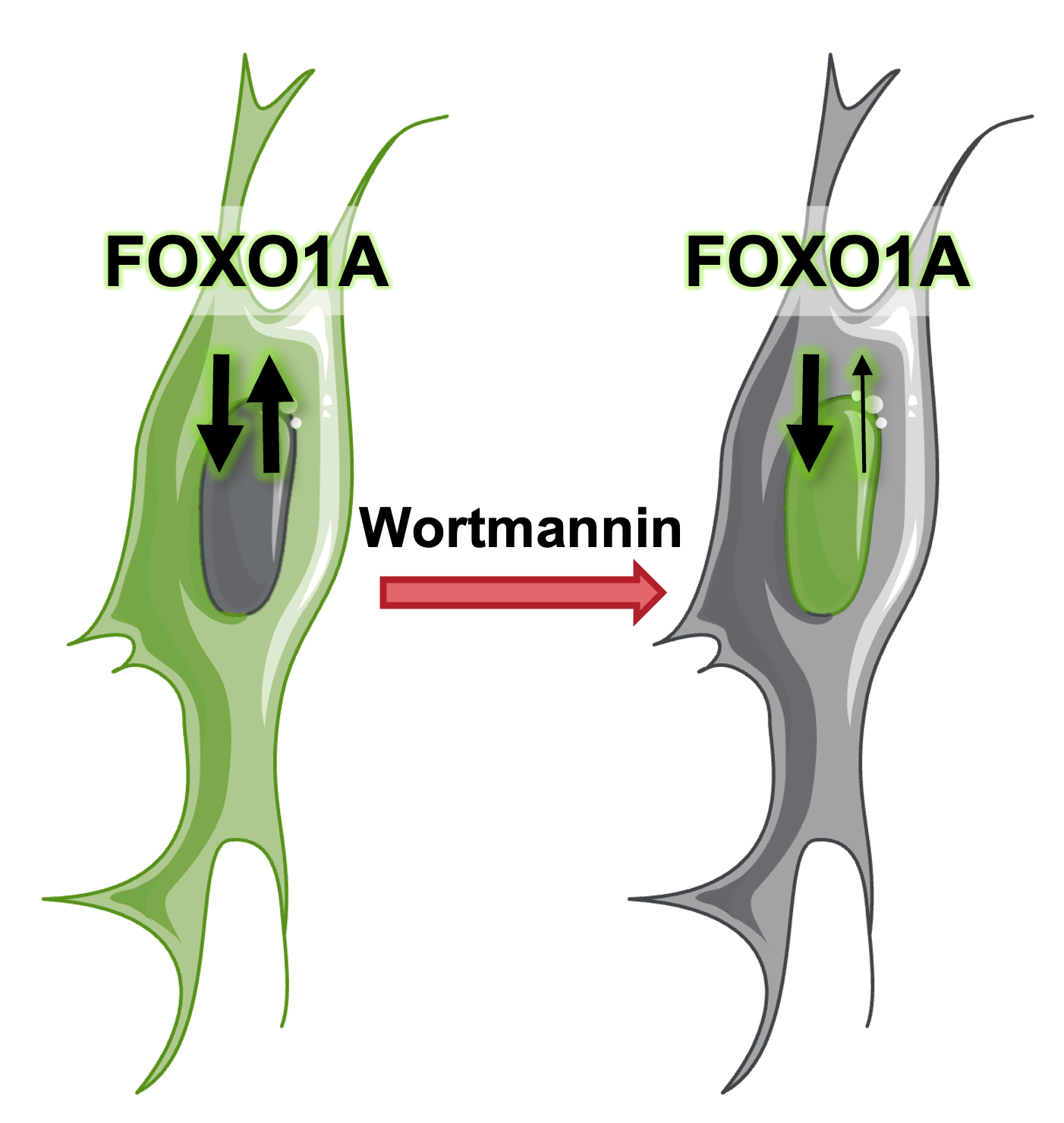
Schematic representation of FOXO1A mechanism
Materials necessary for this exercise#
No download is needed: the images are included in Piximi as an example project called Translocation Tutorial. It contains all the images, already labeled with the corresponding treatment (Wortmannin concentration or Control).
Exercise instructions#
Read through the steps below and follow instructions where stated. Steps where you must figure out a solution are marked with 🔴 TO DO.
1. Load the Piximi project#
🔴 TO DO
Start Piximi by going to:https://piximi.app/
Load the example project: On the start screen, click
Open Example Projectand selectTranslocation Tutorial. If you already have a project open, you can reach the same list throughOpen>Project>Load Example. You can optionally change the project name in the top left panel, such as “Piximi Exercise”. As it is loaded, you can see the progression in the top left corner logo .
.
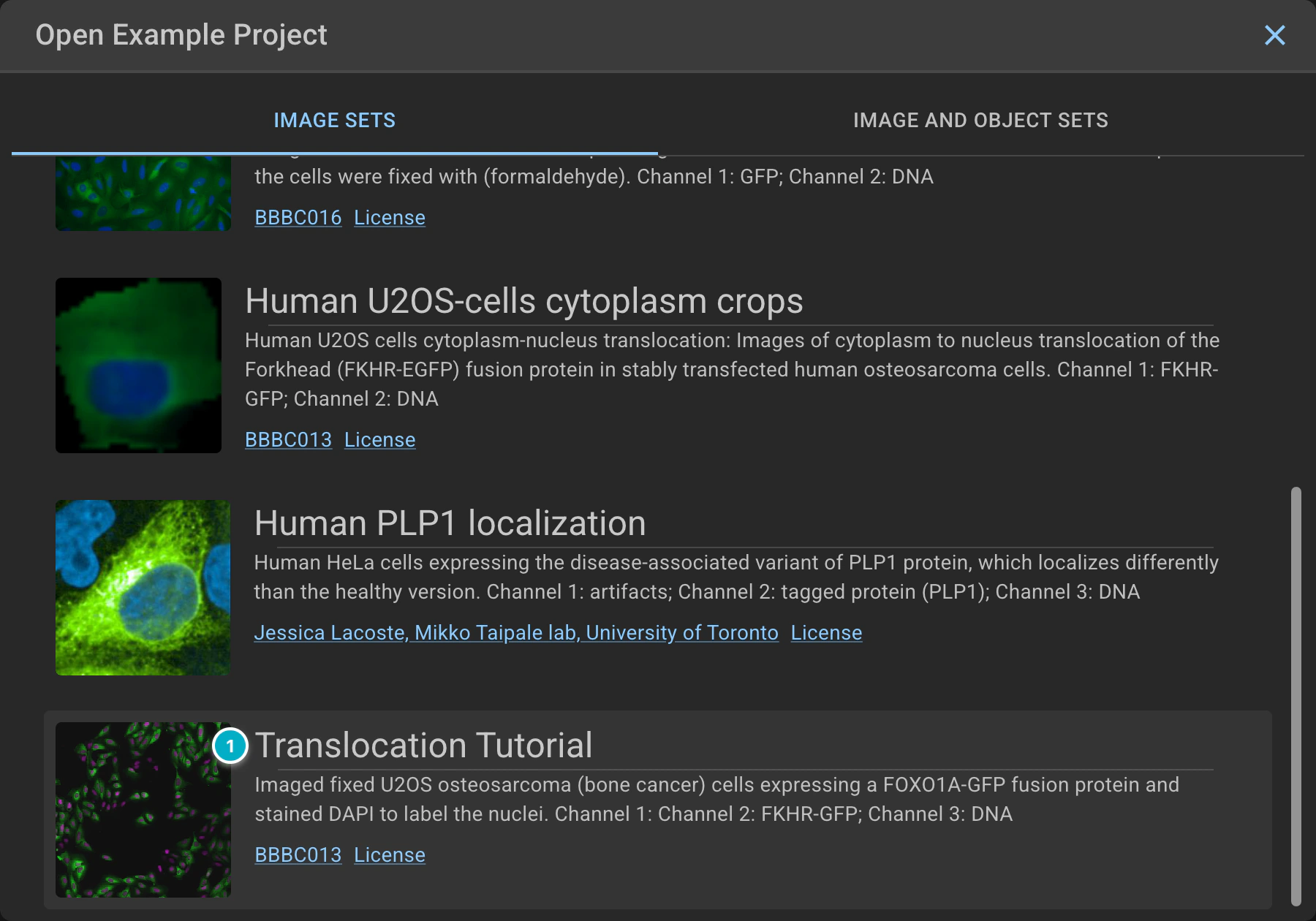
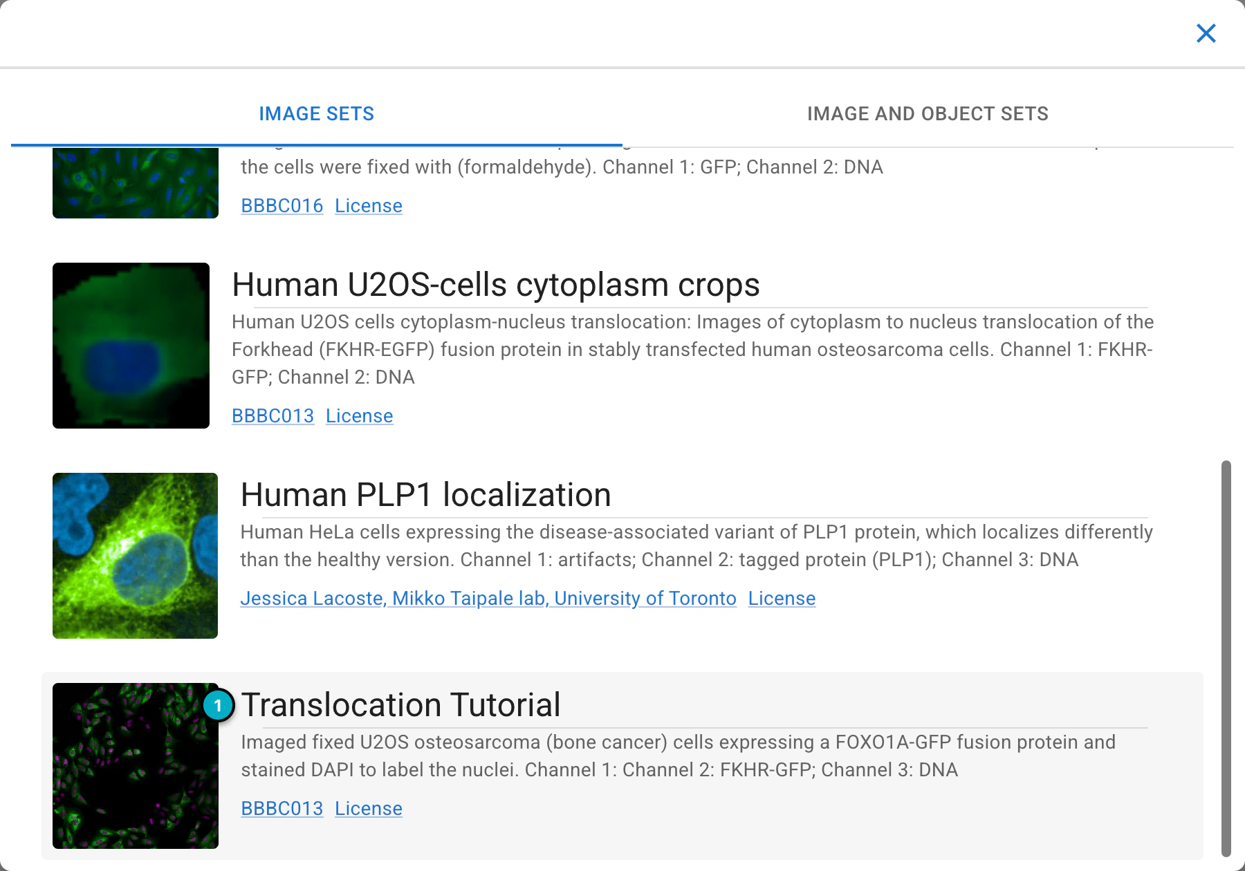
Loading the Translocation Tutorial example project.
2. Check the loaded images and explore the Piximi interface#
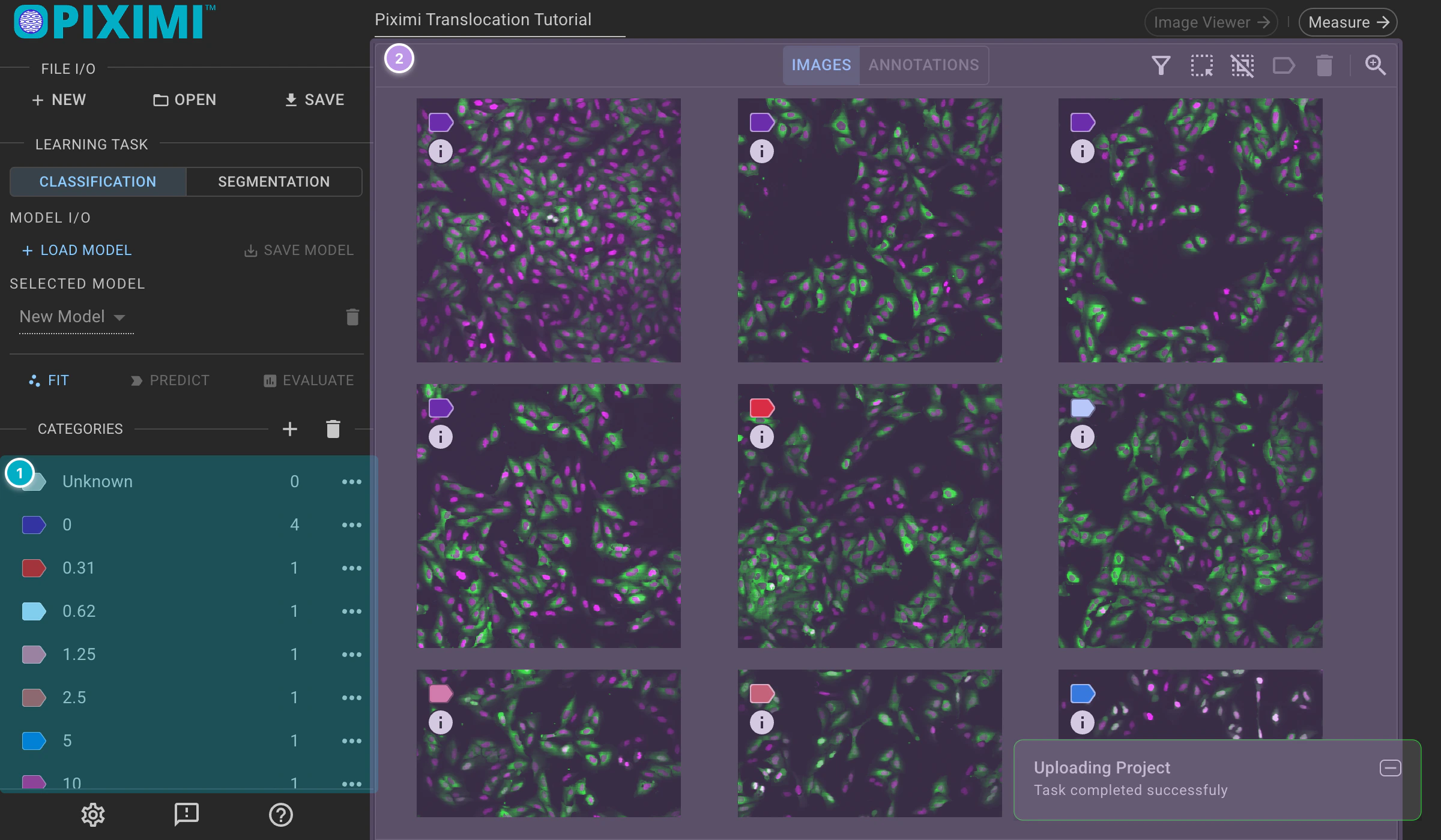
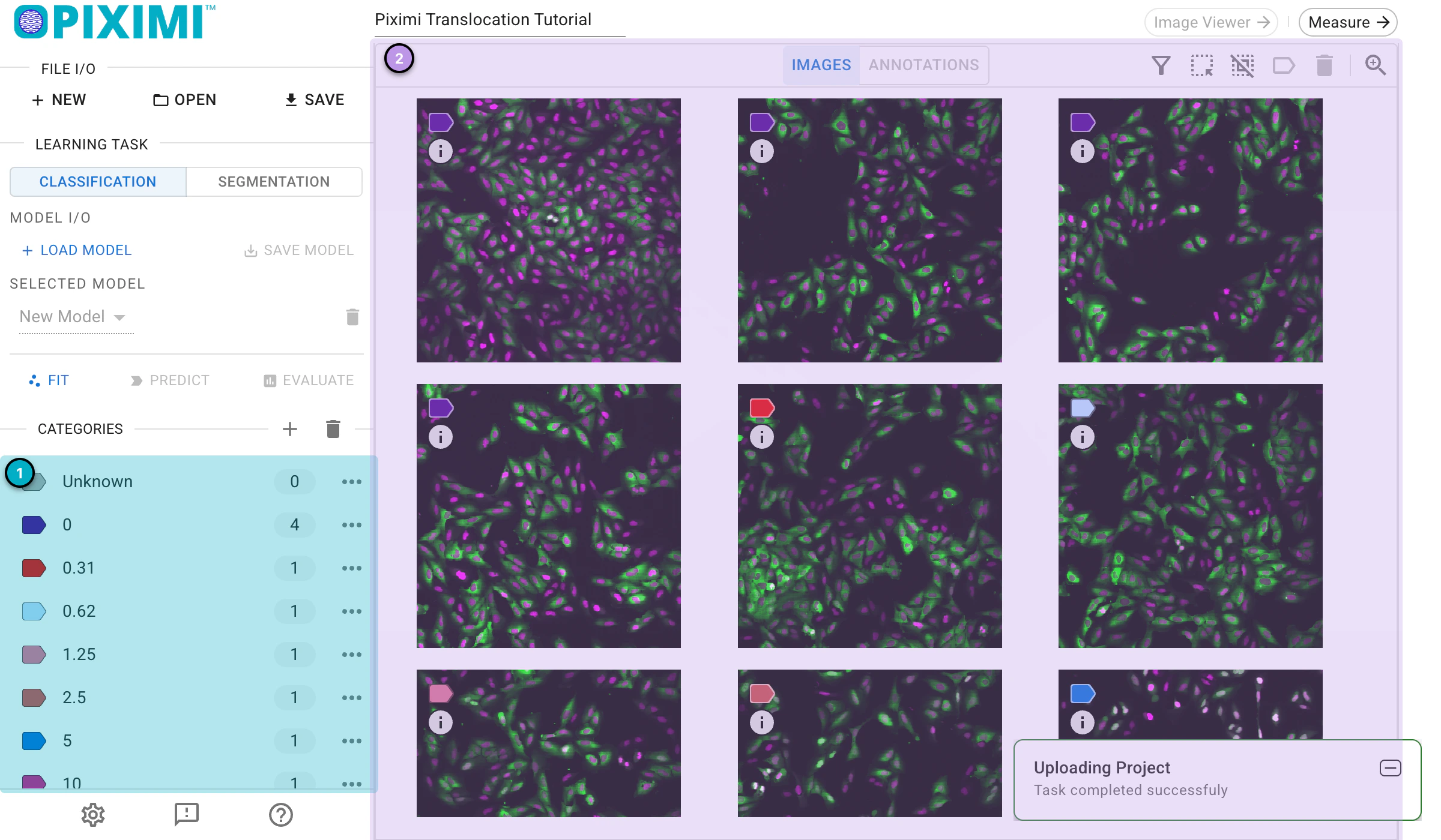
Viewing the project images.
These 17 images represent Wortmannin treatments at ten different concentrations (expressed in nM), as well as mock treatments (0 nM). Note the DAPI channel (Nuclei) is shown in magenta and that the GFP channel (FOXOA1) is shown in green.
The colored labels at the top left of each image, and the Categories list on the left, come from metadata saved with the example project. In this tutorial, the different colored labels indicate the concentration of Wortmannin, while the numbers in the list represent the number of images in each category.
Optionally, you can label the images manually by clicking the + (New Category) icon next to Categories and entering a name, then selecting images in the grid and clicking the Categorize icon above them to assign a category. In this tutorial, we’ll skip this step since the labels are already part of the project. More information can be found in the Project Viewer section of the docs.
3. Segment Cells - Find out the cells from the background#
🔴 TO DO
To start the prediction on all images, click the
Select allicon above the images.
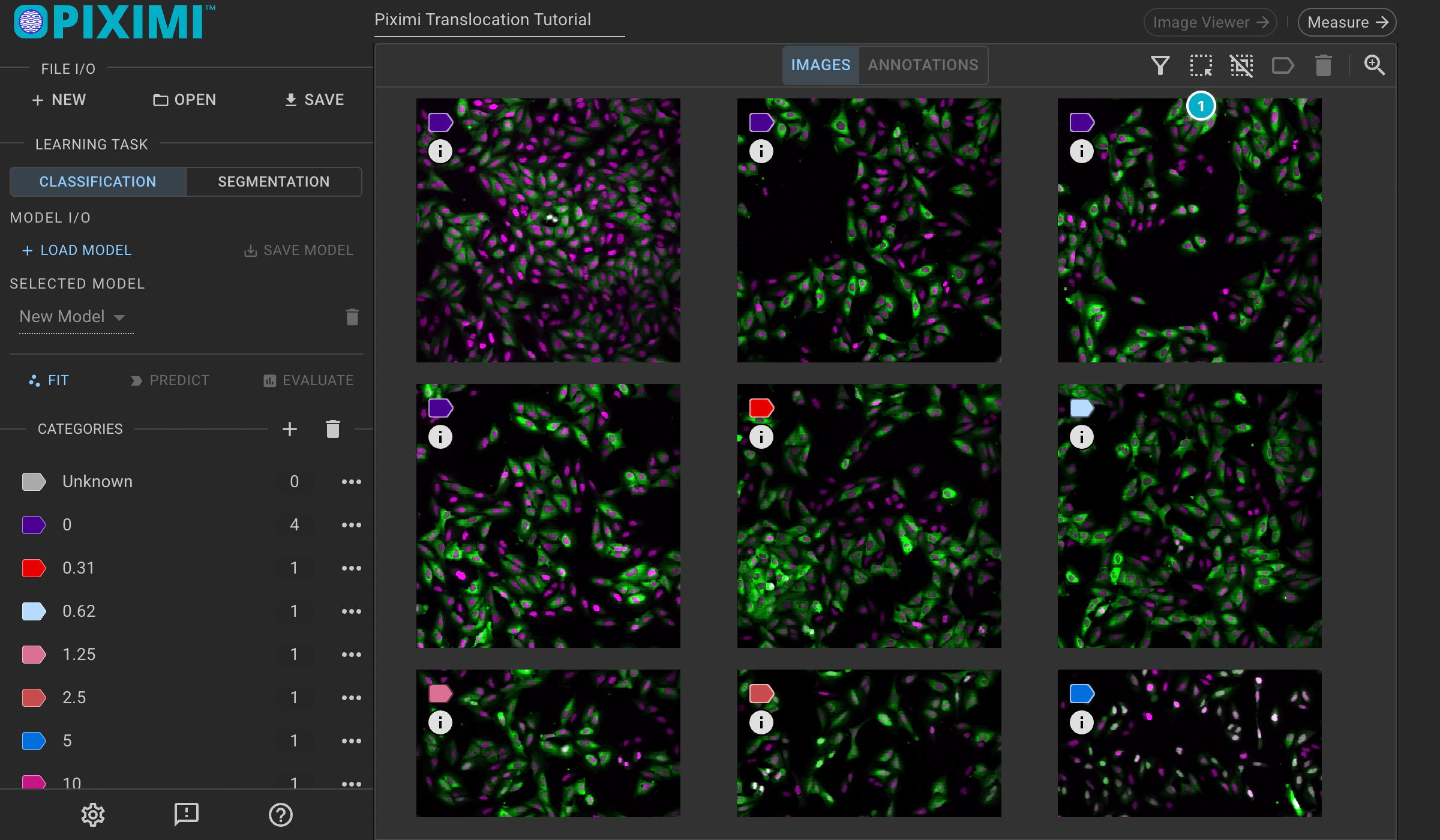
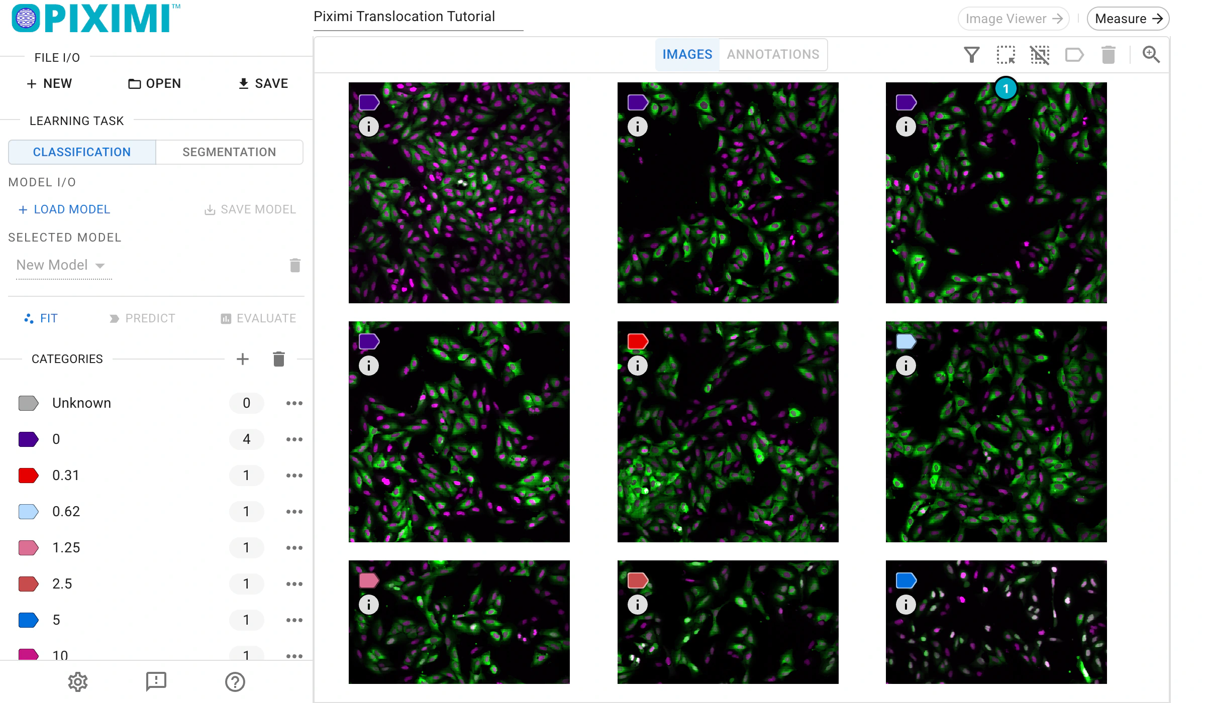
Selecting all images.
In the
Learning Tasksection, change the task toSegmentation.
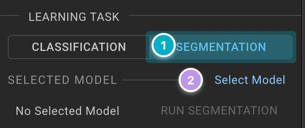
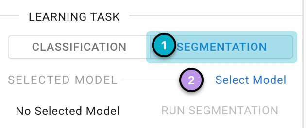
Switching the Learning Task to Segmentation.
Click on
Select Modeland theLoad Segmentation Modelwindow will pop up, allowing you to choose a pretrained model.
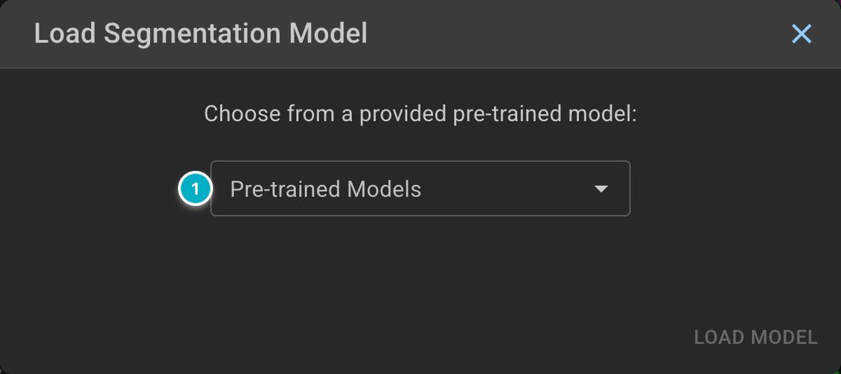
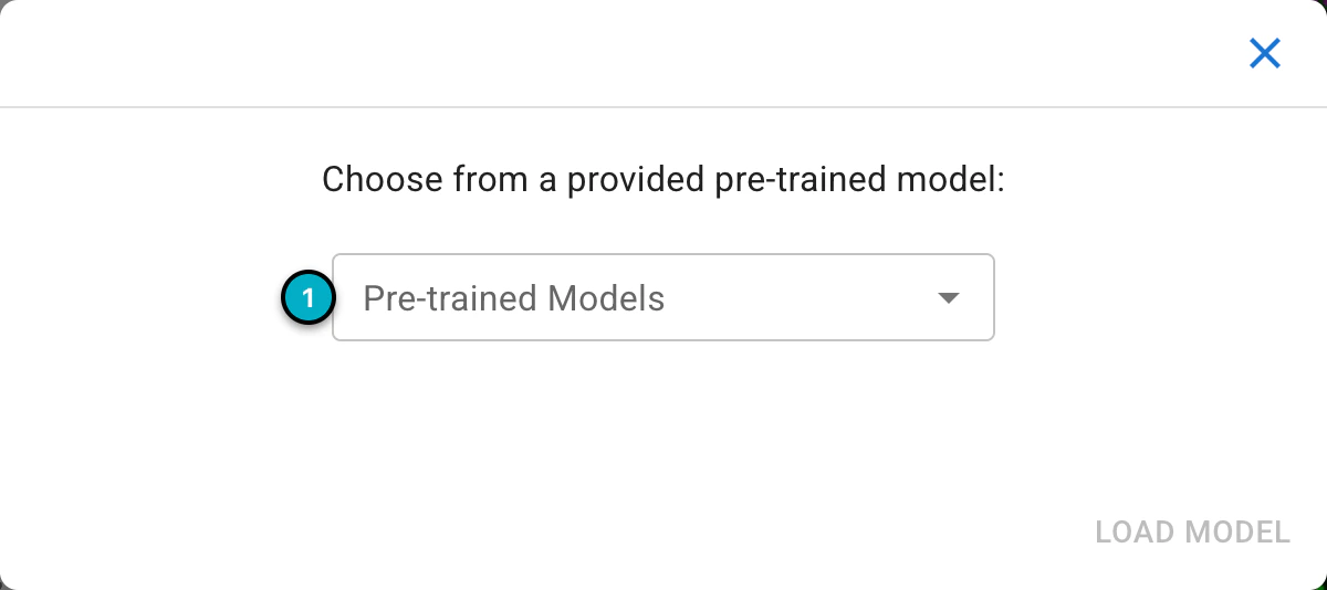
The Load Segmentation Model window.
For today’s exercise, select
Cellpose-SAMfrom thePre-trained Modelslist. More information about the models supported can be found here. ClickLoad Modelto load your model and select it. The model runs in your browser, so the first load downloads the model files (Cellpose-SAM is about 588 MB and needs a WebGPU-capable browser).
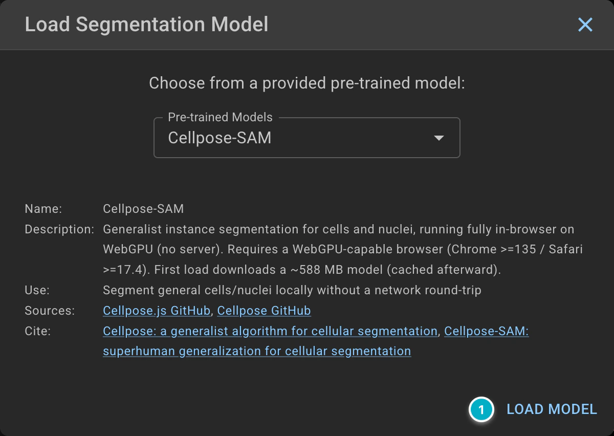
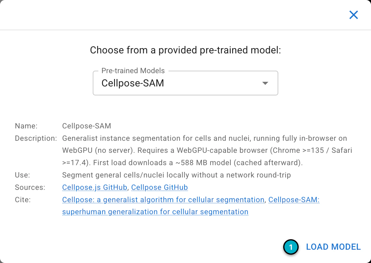
Choosing Cellpose-SAM from the Pre-trained Models list.
Finally, click
Run Segmentation. The segmented objects will be added to the project as a new kind, named after theOutput kind name(cellpose_cellsby default). Piximi shows the progress of the segmentation while it runs.
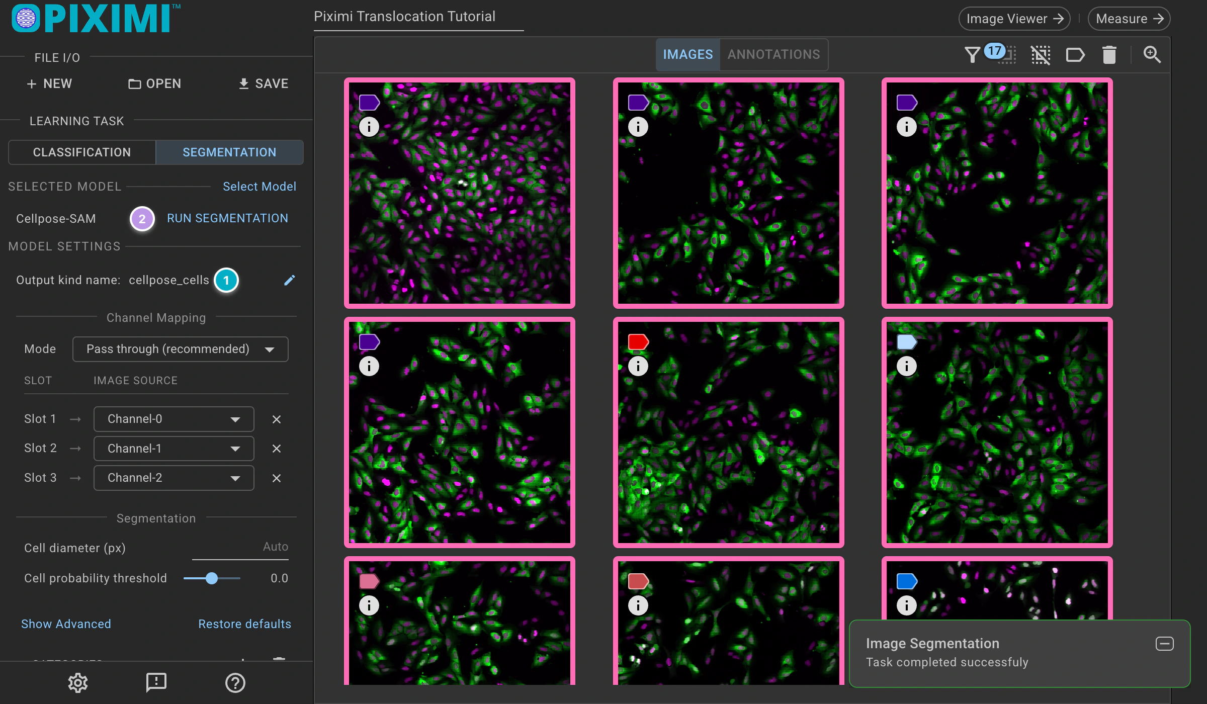
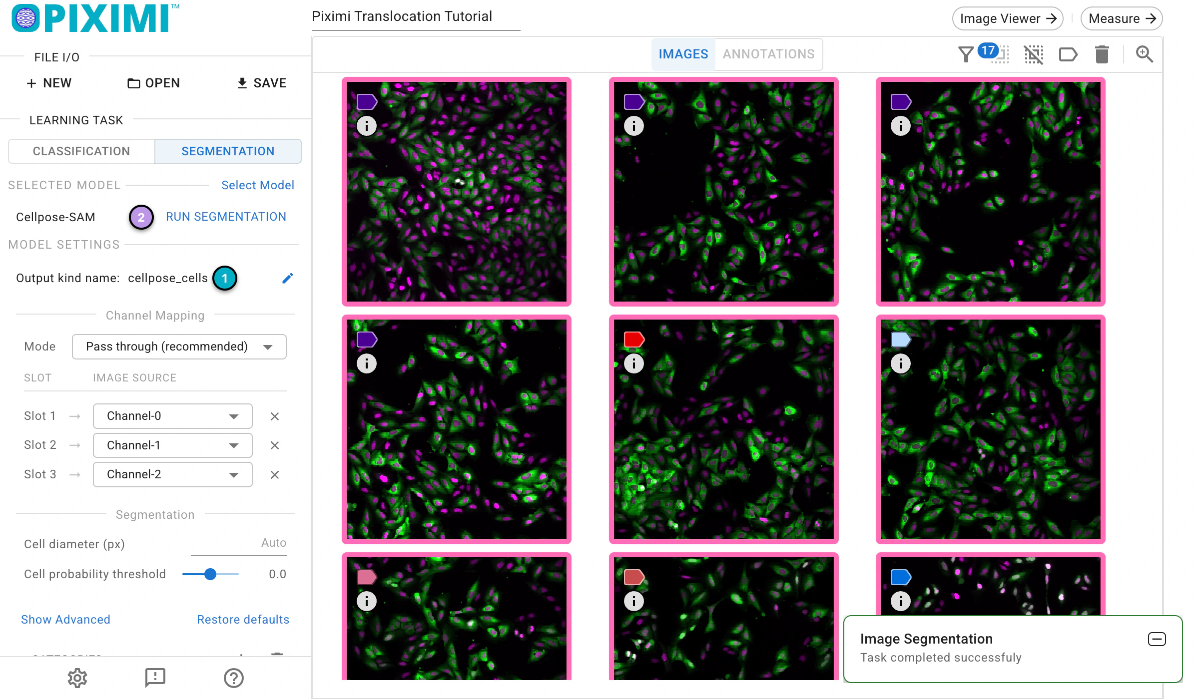
Running the segmentation.
Please note that the previous steps were performed on your local machine, meaning your images are stored locally. Cellpose-SAM inference also runs locally in your browser, so your images are never uploaded.
4. Visualize segmentation result and fix the segmentation errors#
🔴 TO DO
Click
Annotationsabove the image grid and then the cellpose_cells tab to check the individual cells that have been segmented.
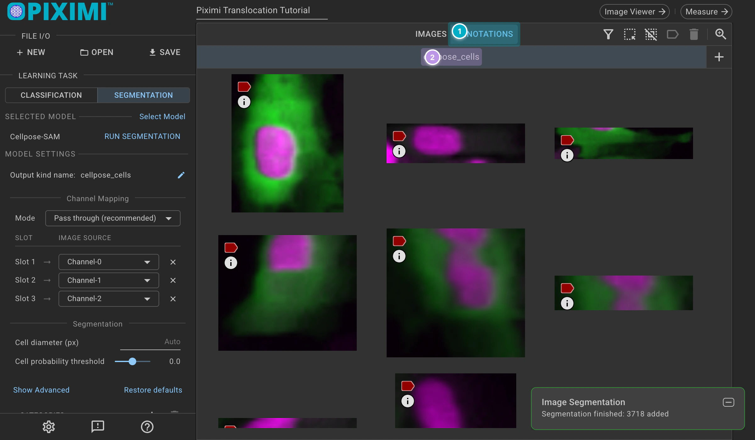
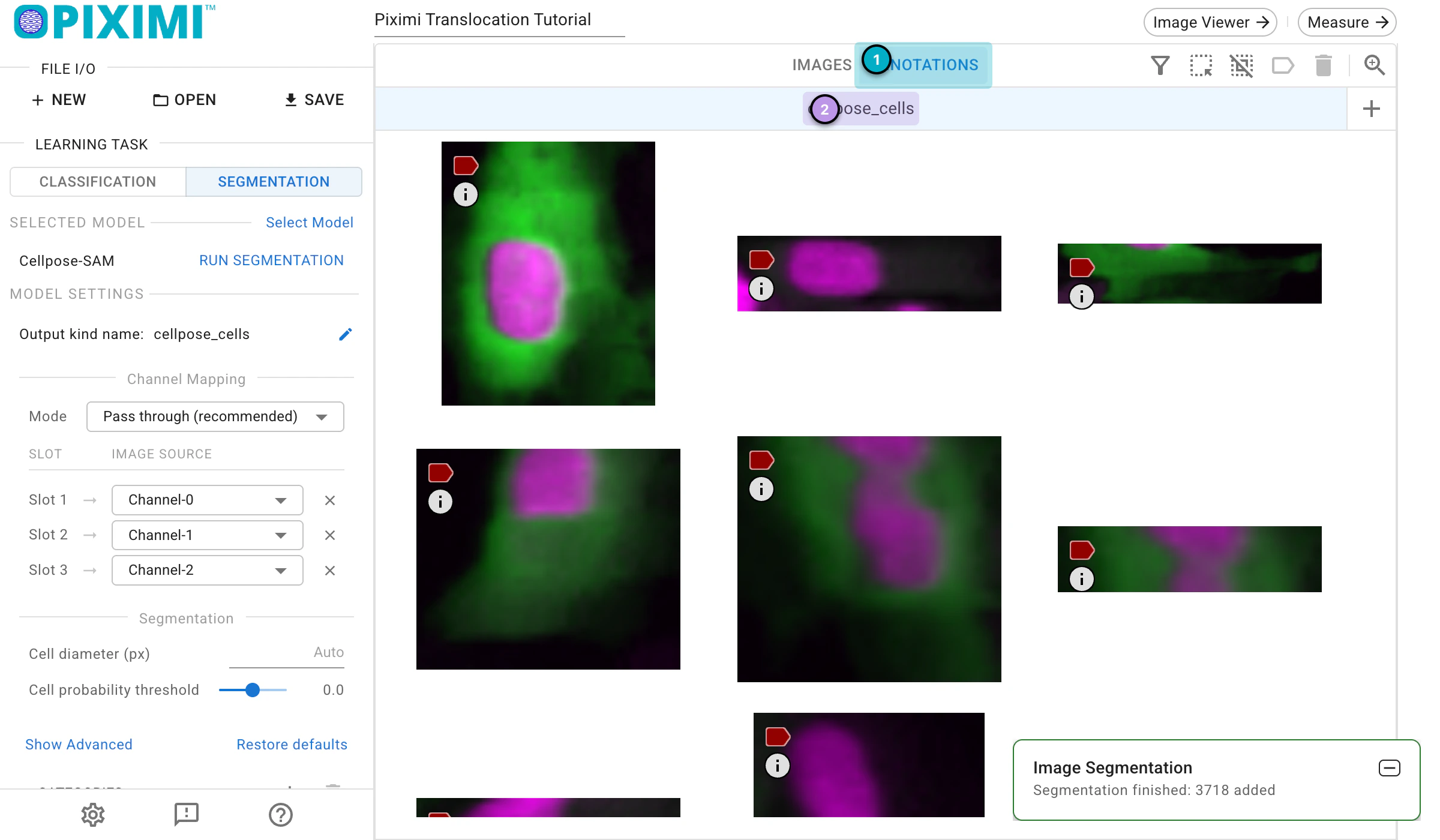
Viewing the cellpose_cells kind.
Select some identified objects or whole images, then click
Image Viewerin the top bar to view them in the Image Viewer.
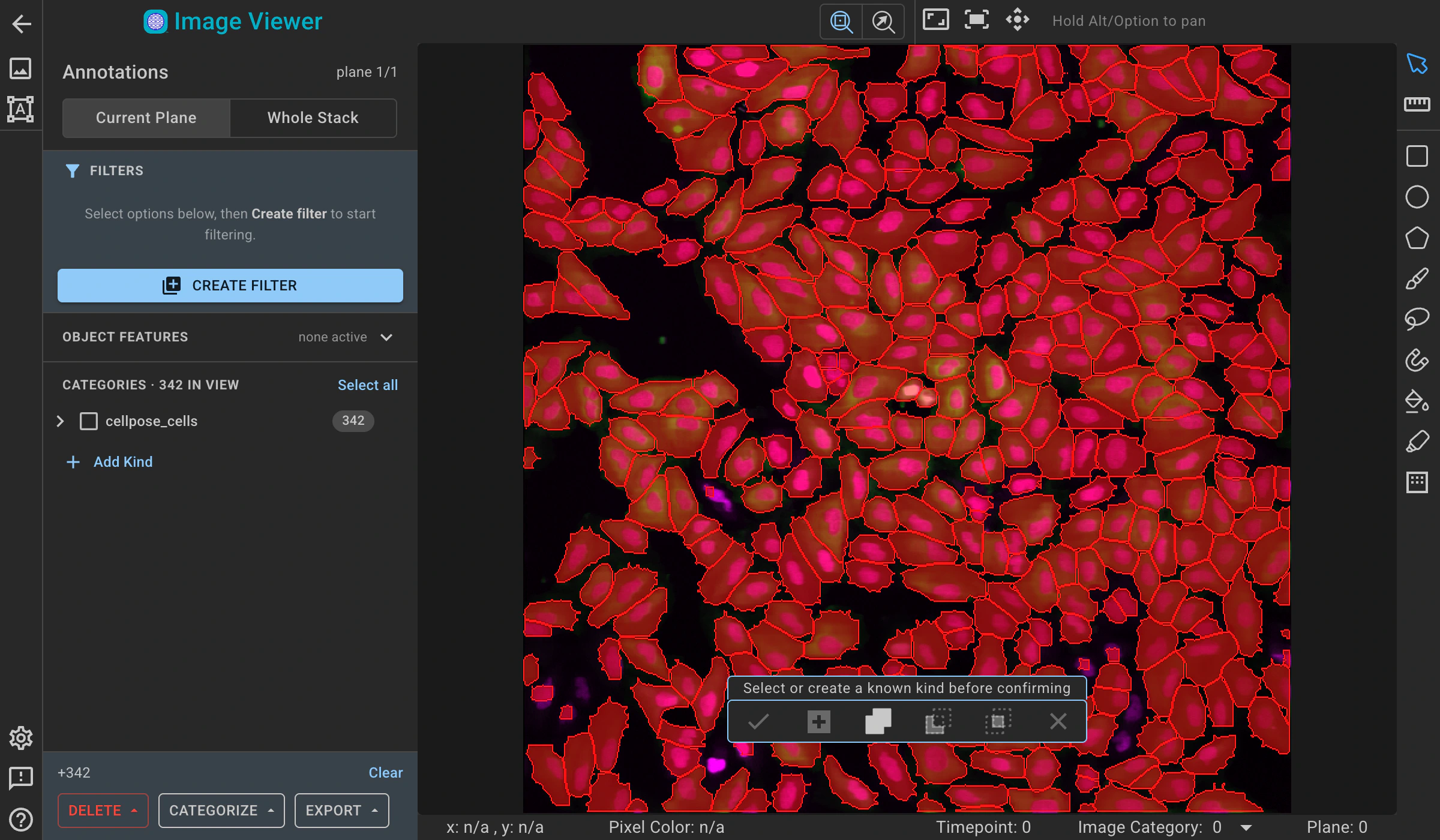
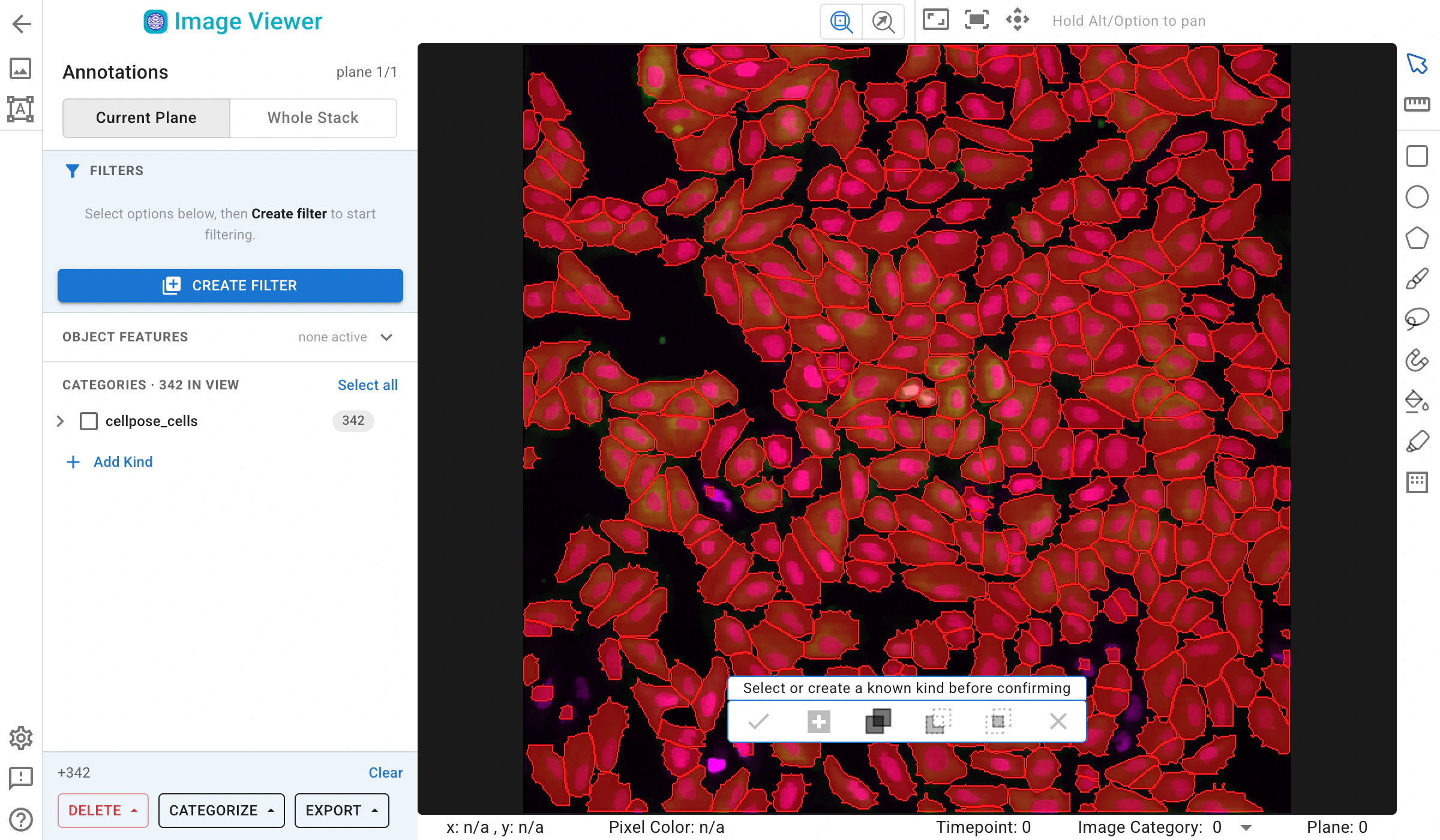
Viewing the segmented cells in the Image Viewer.
Optionally, here you can manually refine the segmentation using the annotator tools. The Piximi annotator provides several options to add, subtract, or intersect annotations. Additionally, the selection tool allows you to resize or delete specific annotations. To begin editing, select specific or all images by clicking the checkbox at the top.
Optionally, you can adjust channels: Although there are two channels in this experiment, the nuclei signal is duplicated in both the red and green channels. This design is intended to be color-blind friendly and to produce a magenta color for nuclei. The green channel also includes cytoplasmic signals.
Another reason for duplicating the channels is that some models—such as the Cellpose model we used today—require a three-channel input.
You can choose to manually segment the cells to generate masks for ground truth data.
5. Classify cells#
Reason for doing this: We want to classify the cellpose_cells based on GFP distribution (on Nuclei, cytoplasm, or no GFP) without manually labeling all of them. To do this, we can use the classification function in Piximi, which allows us to train a classifier using a small subset of labeled data and then automatically classify the remaining cells.
🔴 TO DO
Go to the cellpose_cells tab (in the
Annotationsview) that displays the segmented objects, and click theClassificationbutton in theLearning Tasksection on the left panel. The categories listed on the left now belong to the cells rather than to the images.
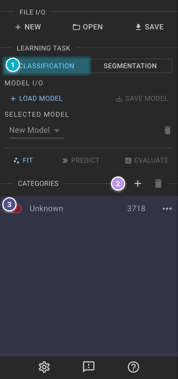
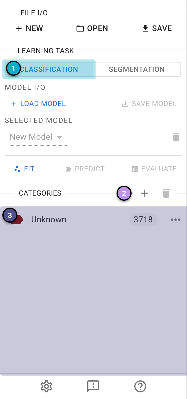
The classification section of the left panel.
Create new categories by clicking the
+(New Category) icon next toCategories, entering a name in theCreate Categorywindow and clickingConfirm. Add three categories: “Cytoplasmic_GFP”, “Nuclear_GFP” and “No_GFP”.
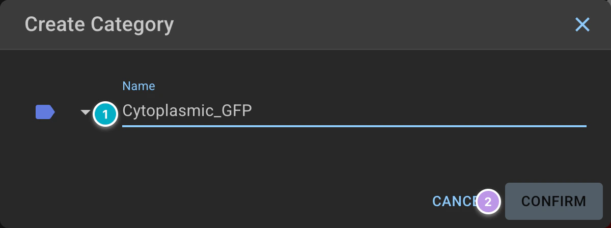
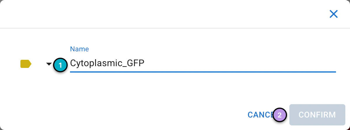
Creating a category.
Click on the cells that match your criteria; each click adds a cell to the selection (use the


Deselecticon to start over). Aim to assign ~20–40 cells per category. Once selected, click the

Categorizeicon above the cells and choose the category to assign it to the selected cells.
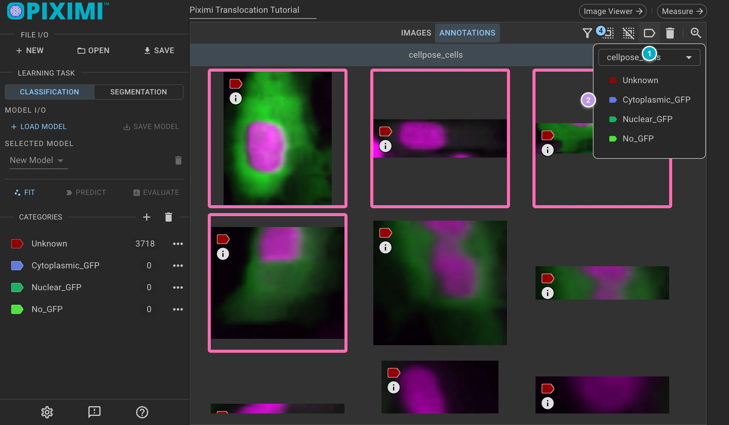
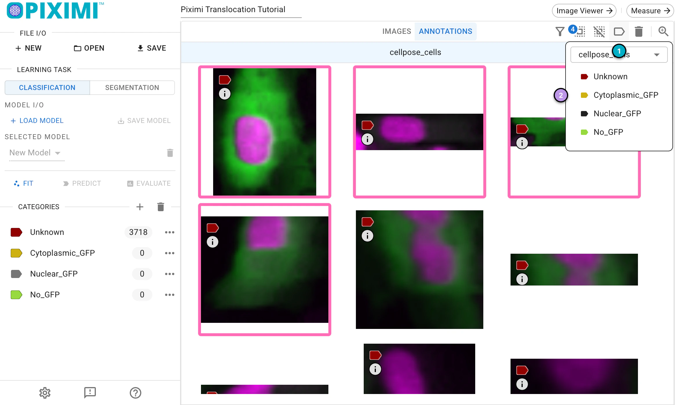
Classifying individual cells based on GFP presence and localization.
6. Train the Classifier model#
🔴 TO DO
Click
Fitin theLearning Tasksection to open theFit Modelwindow with the model settings (Hyperparameterstab). For today’s exercise, we’ll adjust a few parameters:Check that the
Model Architectureis set to Simple CNN (the default).Under
Data Preprocessing Settings>Image Augmentation, update theInput Shapeto:Row: 48
Col: 48
Ch.: 3 (since our images are in RGB format)
(You can change to other numbers such as 64, 128)
Under
Data Partitioning, set theTraining Percentageto 0.75, which reserves 25% of the labeled data for validation.
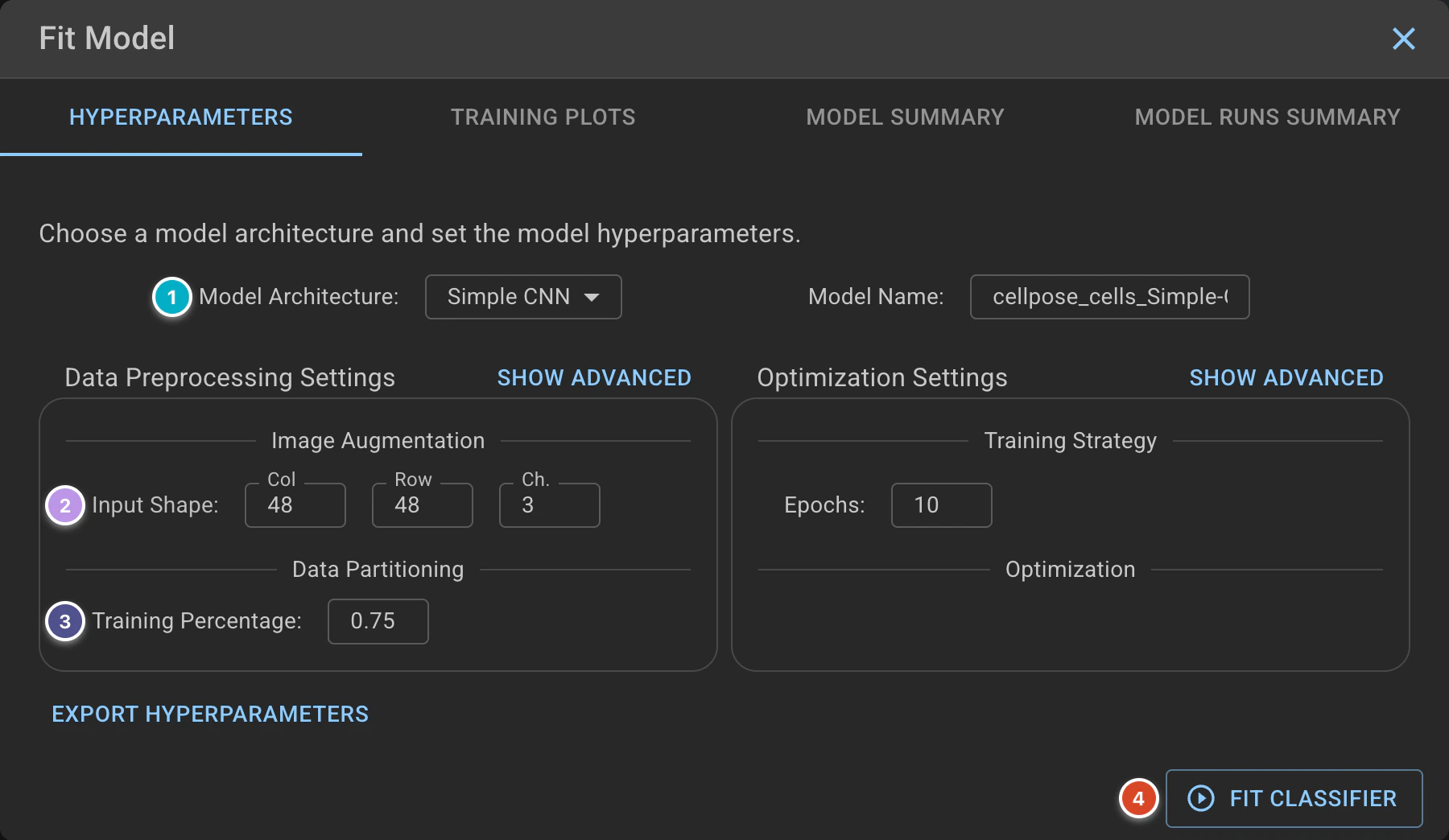
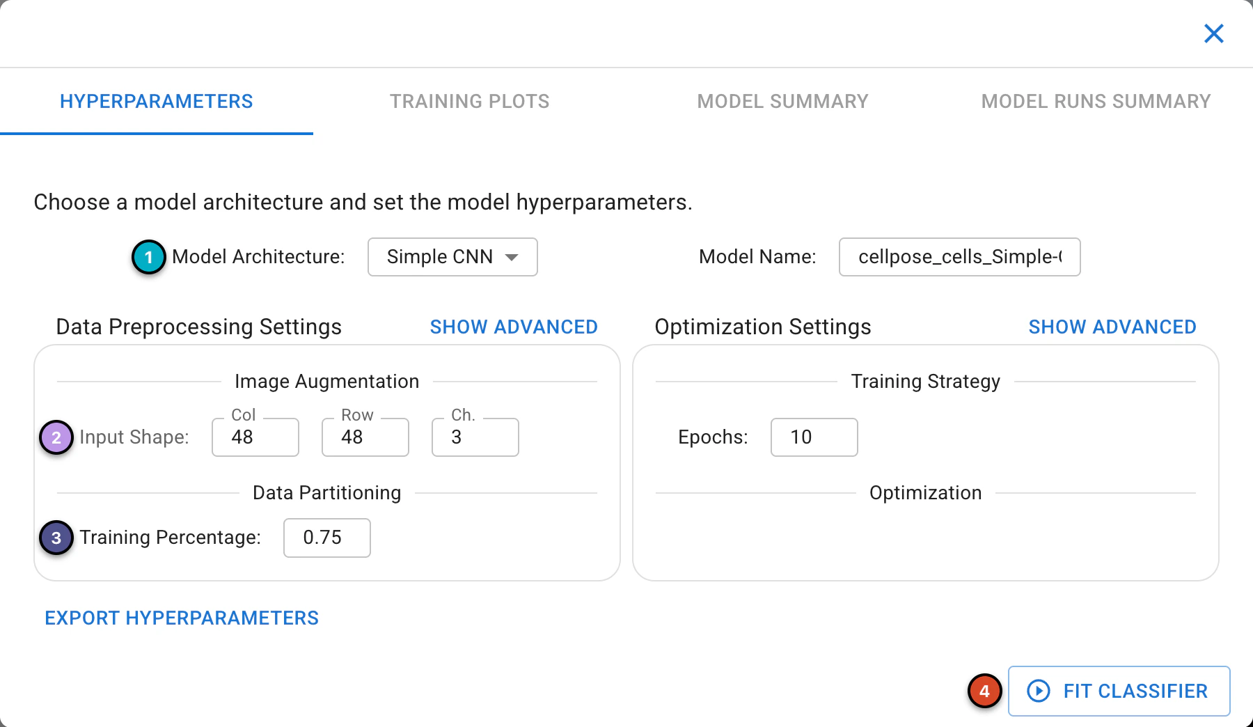
Classifier model setup.
When you click
Fit Classifierin Piximi, the window switches to theTraining Plotstab, where two training plots appear, “Accuracy per Epoch” and “Loss per Epoch”. Each plot shows curves for both training and validation data.
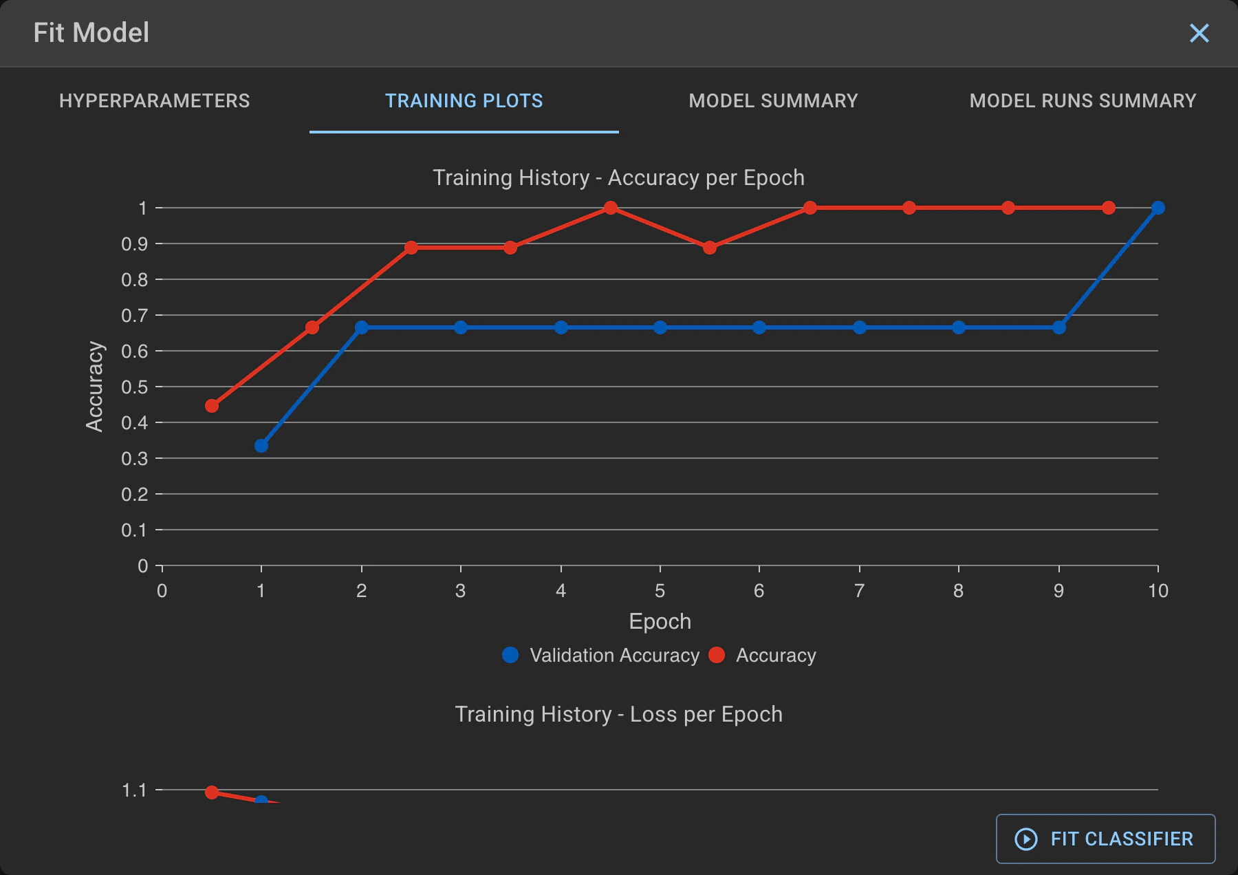
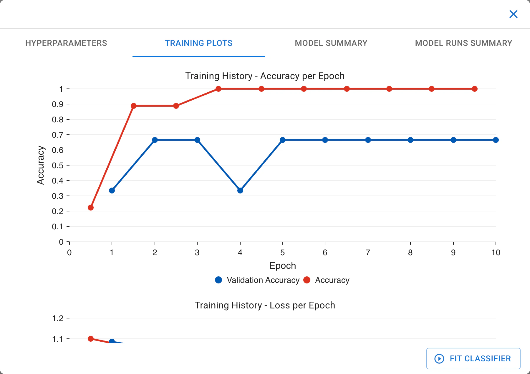
Training history plots.
In the accuracy plot, you’ll see how well the model is learning. Ideally, both training and validation accuracy should increase and stay close.
In the loss plot, lower values mean better performance. If validation loss starts rising while training loss keeps dropping, the model might be overfitting.
These plots help you understand how the model is learning and whether adjustments are needed. Close the Fit Model window with the  in its top right corner when you are done.
7. Evaluate model:#
🔴 TO DO
Click

Evaluateto evaluate the model we just trained. The confusion matrix and evaluation metrics compare the model’s predictions on the validation cells to their ground truth labels.
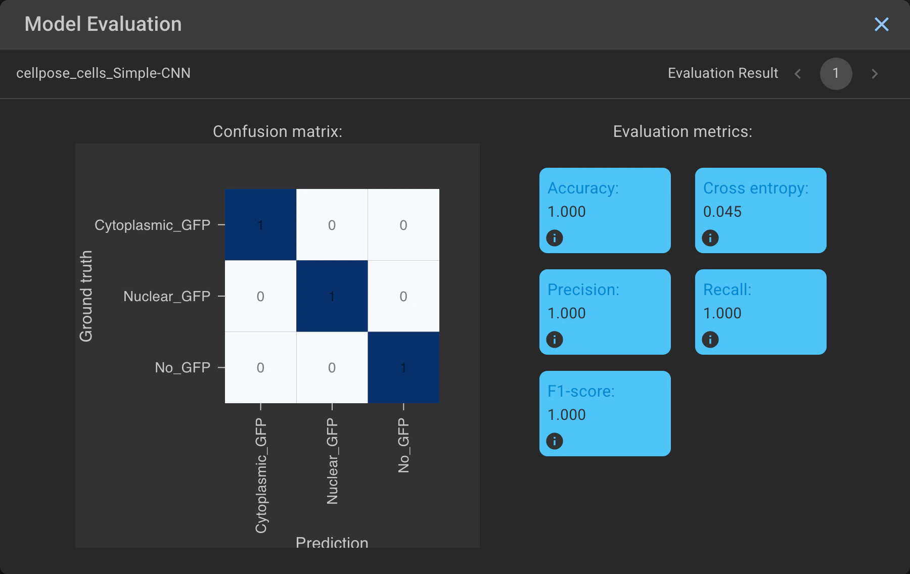
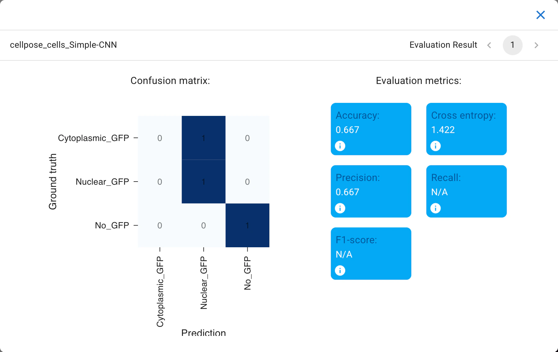
Training run evaluation.
Click

Predictto apply the model we just trained. This step will generate predictions on the cells we did not categorize.
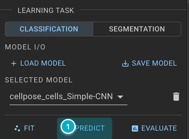
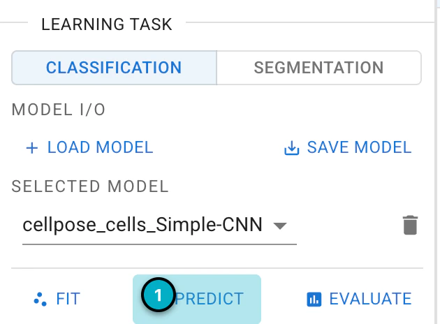
Predict with the classifier.
You can review the predictions in the cellpose_cells tab. Predicted categories are only shown, not applied, until you accept them, and
Clear Predictionsdiscards them.Optionally, you can continue categorizing cells to refine the ground truth and improve the classifier, then fit and predict again. This process is part of the Human-in-the-loop classification, where you iteratively correct and train the model based on human input.
Click and hold

Accept Predictions (Hold)to assign the predicted labels to all the objects.
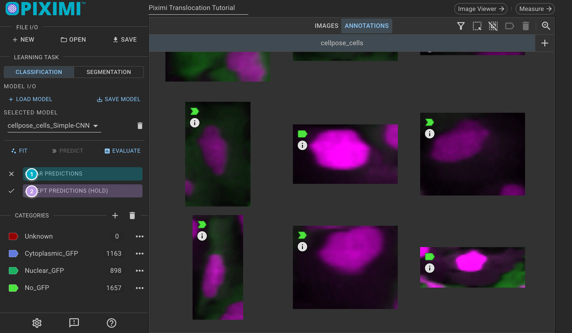
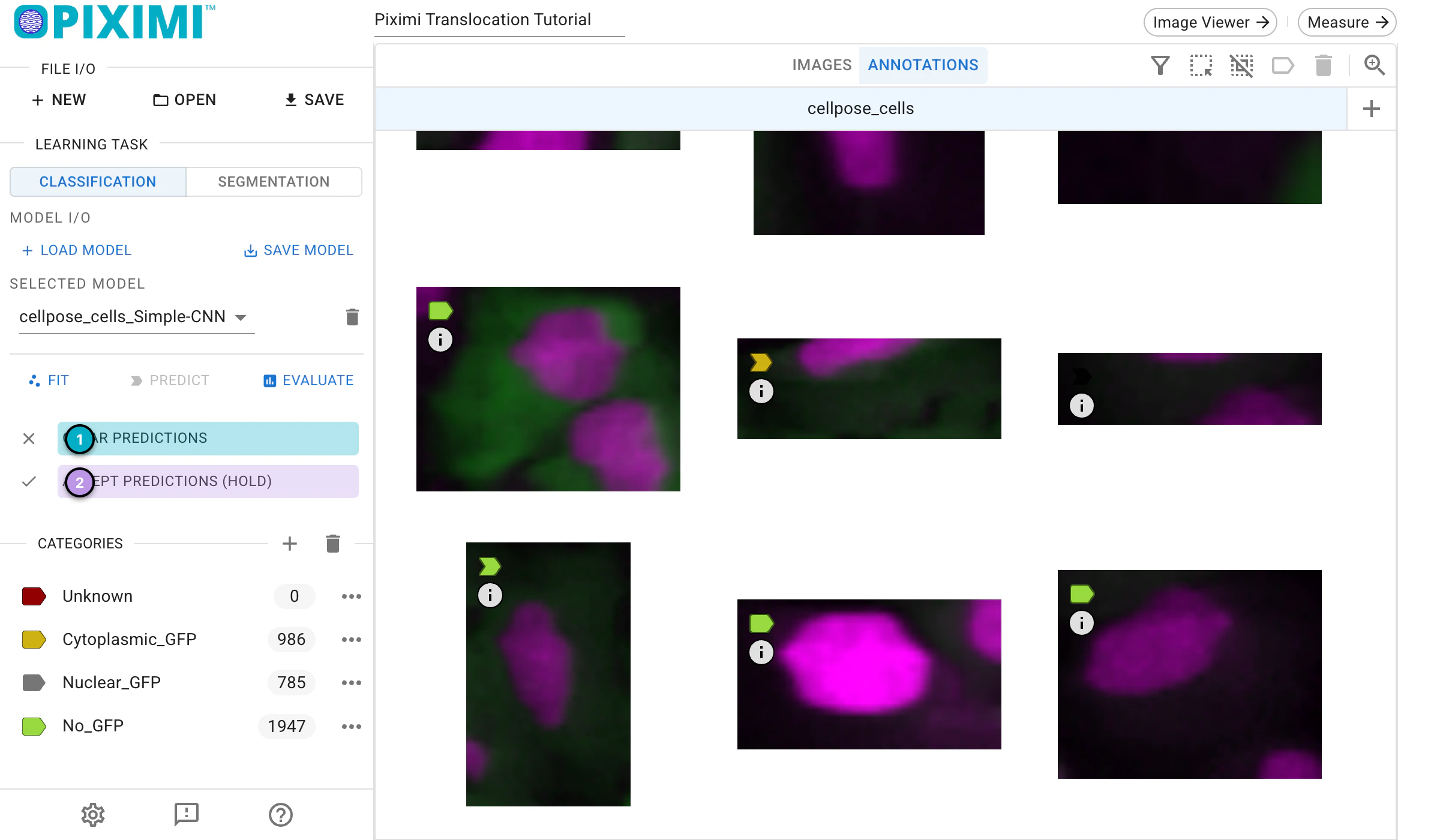
Accept predictions.
8. Measurement#
Once you are satisfied with the classification, we will proceed to measure the objects. The goal of today’s exercise is to determine the minimum concentration of Wortmannin required to block the export of FOXO1A-GFP from the nuclei. To do this, we can measure the total GFP intensity at either the image level or the object level. Here we measure the images, which carry the Wortmannin concentration as their category.
🔴 TO DO
Click
Measurein the top bar of the Project Viewer.
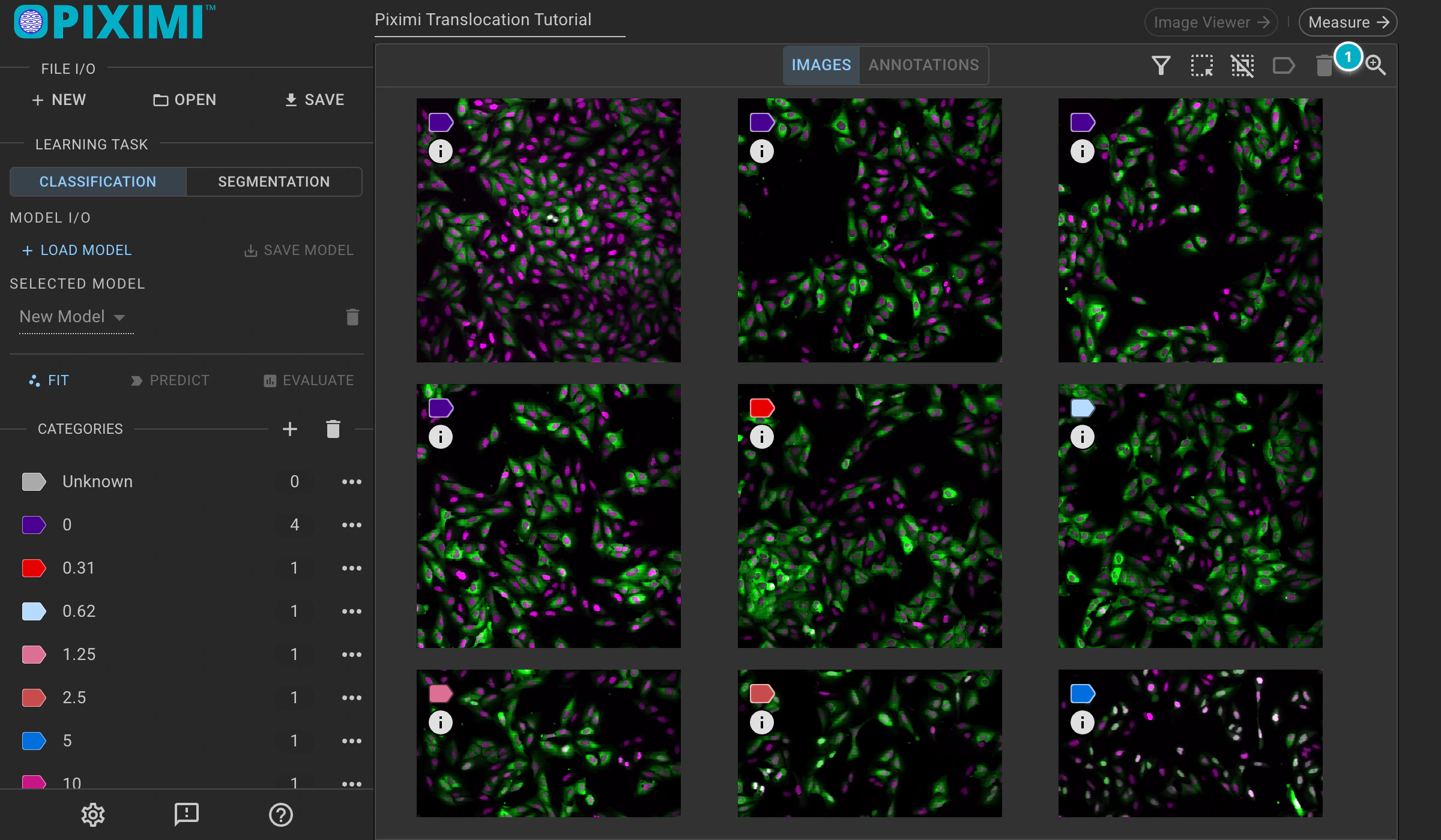
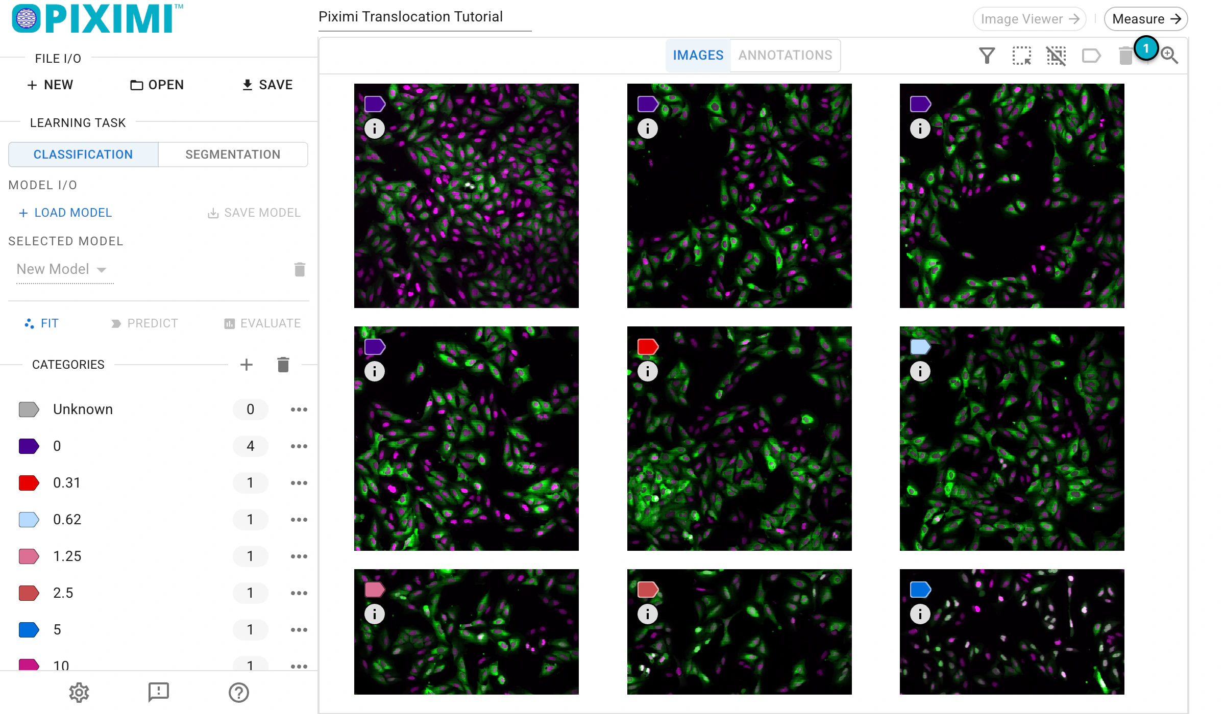
Navigate to Measurements.
Click
Add Table, keepImagesas the kind and clickConfirm. Note: Preparing the data for the measurement step may take some time to process.
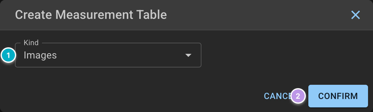
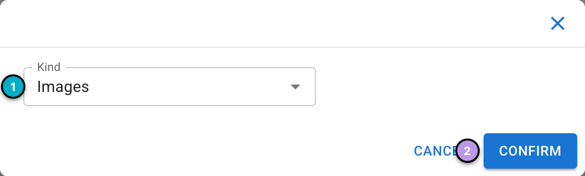
Create an “Images” measurement table.
In the left panel, expand
Intensity>Totaland tickChannel-1to select the measurement for GFP. You will see the measurement in the data grid.Under
Split Options, dragCategoryfromAvailable DimensionsintoColumn Groupingto show the measurements for each category (here, each Wortmannin concentration). The grid shows theCount,Mean,MedianandStd Devof each measurement, and the full dataset is available upon exporting the.csvfile.
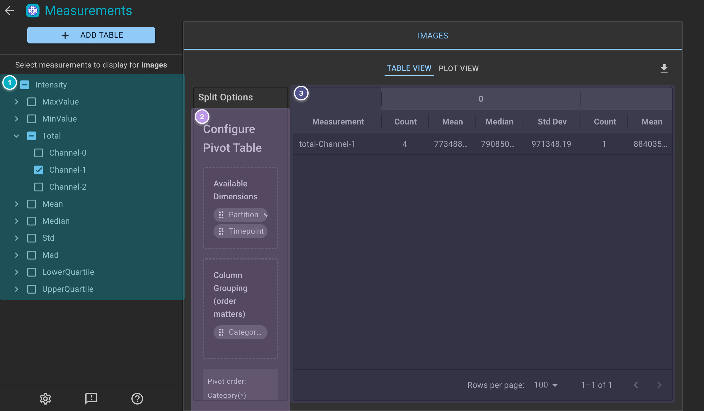
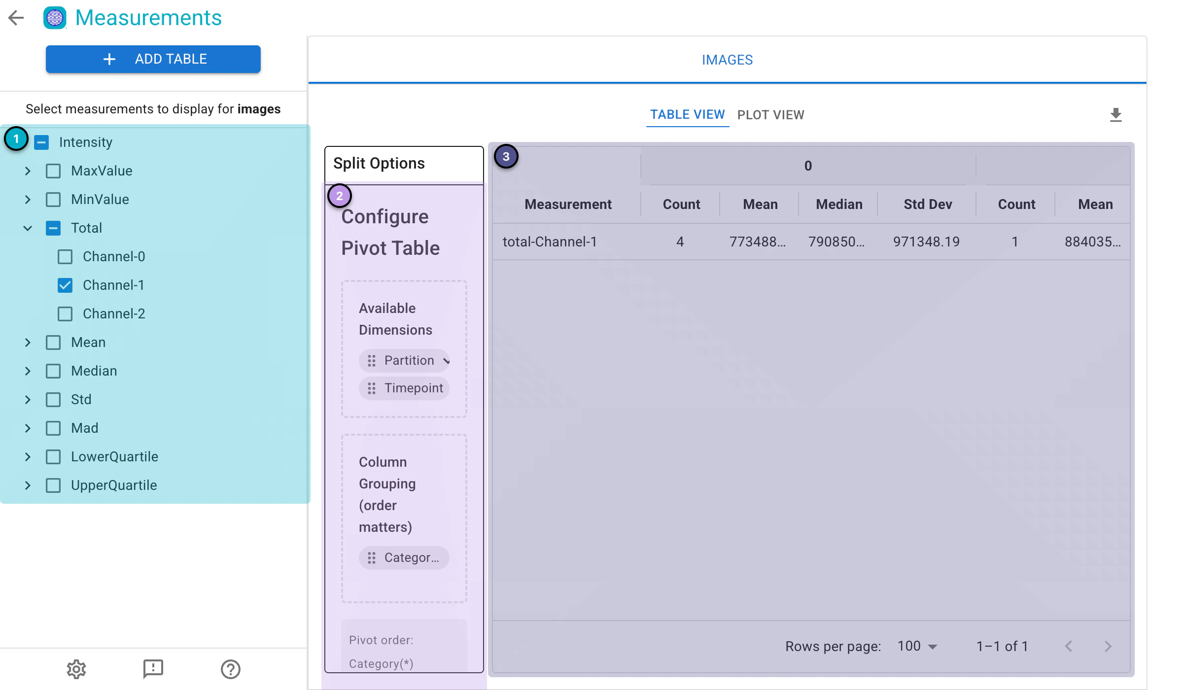
Calculated measurements.
9. Visualization#
After generating the measurements, you can plot the measurements.
🔴 TO DO
Click
Plot Viewabove the table to visualize the measurements.
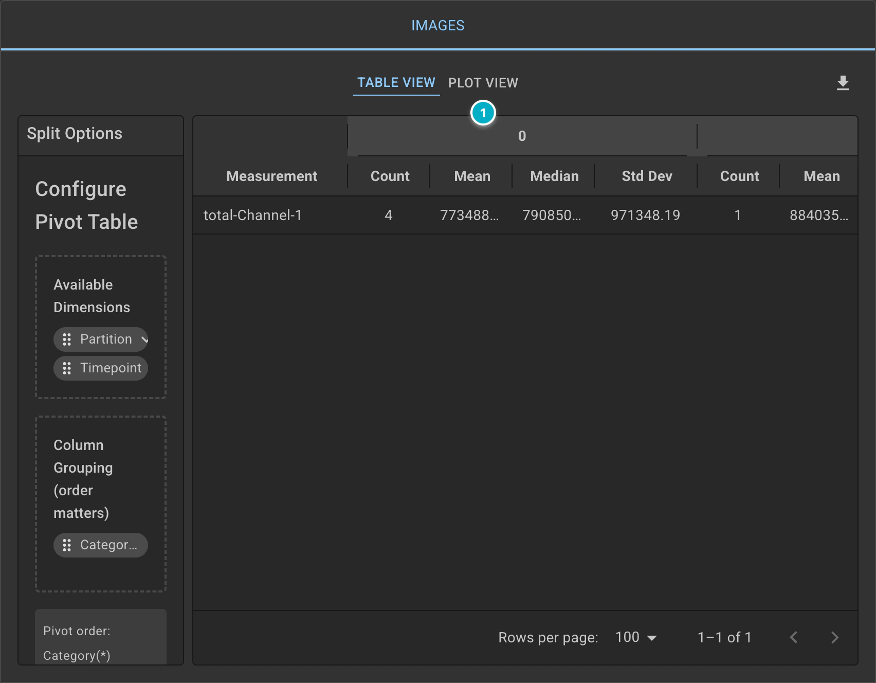
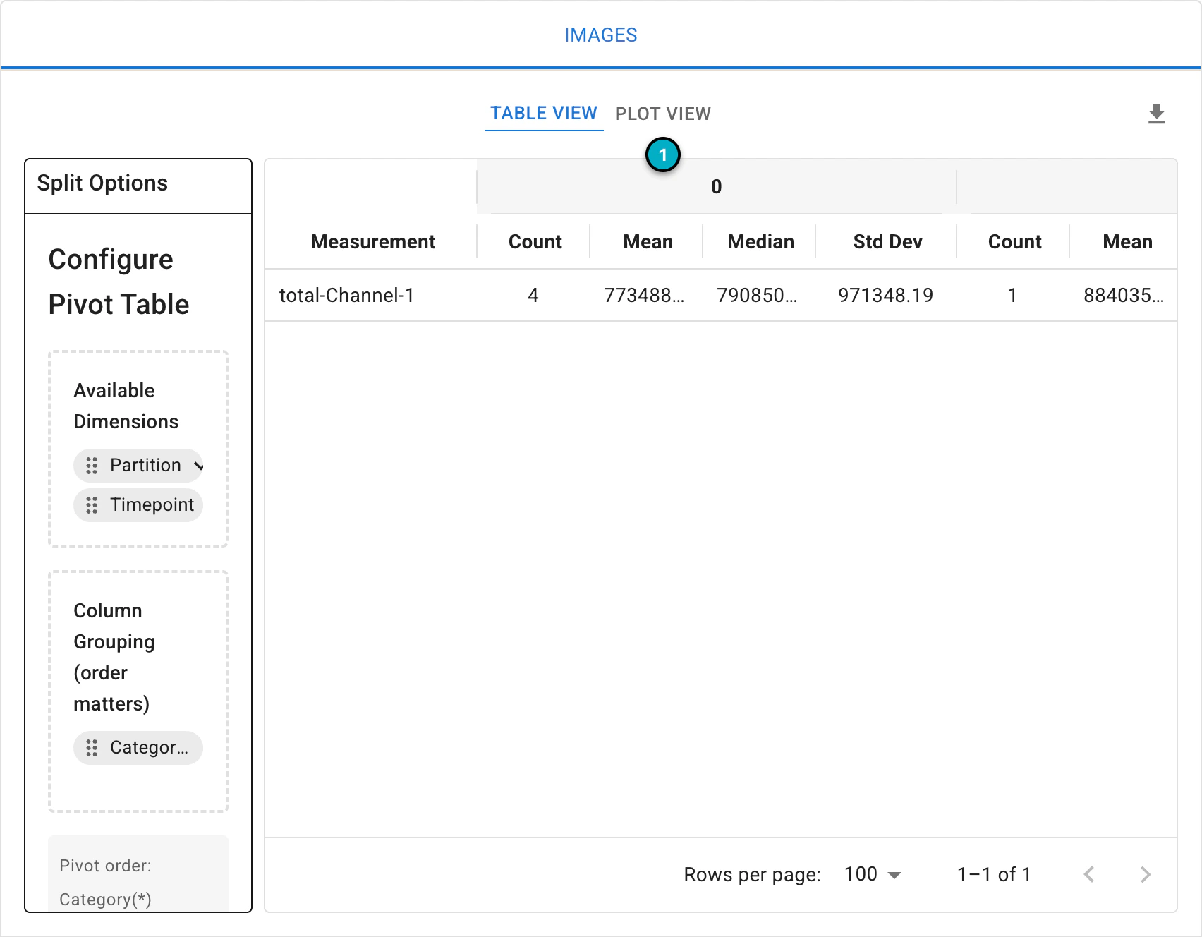
Measurement plots.
Set
PlottoSwarmand choose aColor Themebased on your preference.Select
Y-axisastotal-Channel-1and setSwarmGrouptocategory; this will show how GFP intensity varies across the different categories.Selecting
Show Statisticswill overlay box plots on the swarms, displaying the median, the upper and lower quartiles, and the minimum and maximum of each category.Optionally, you can experiment with different plot types and axes to see if the data reveals additional insights.
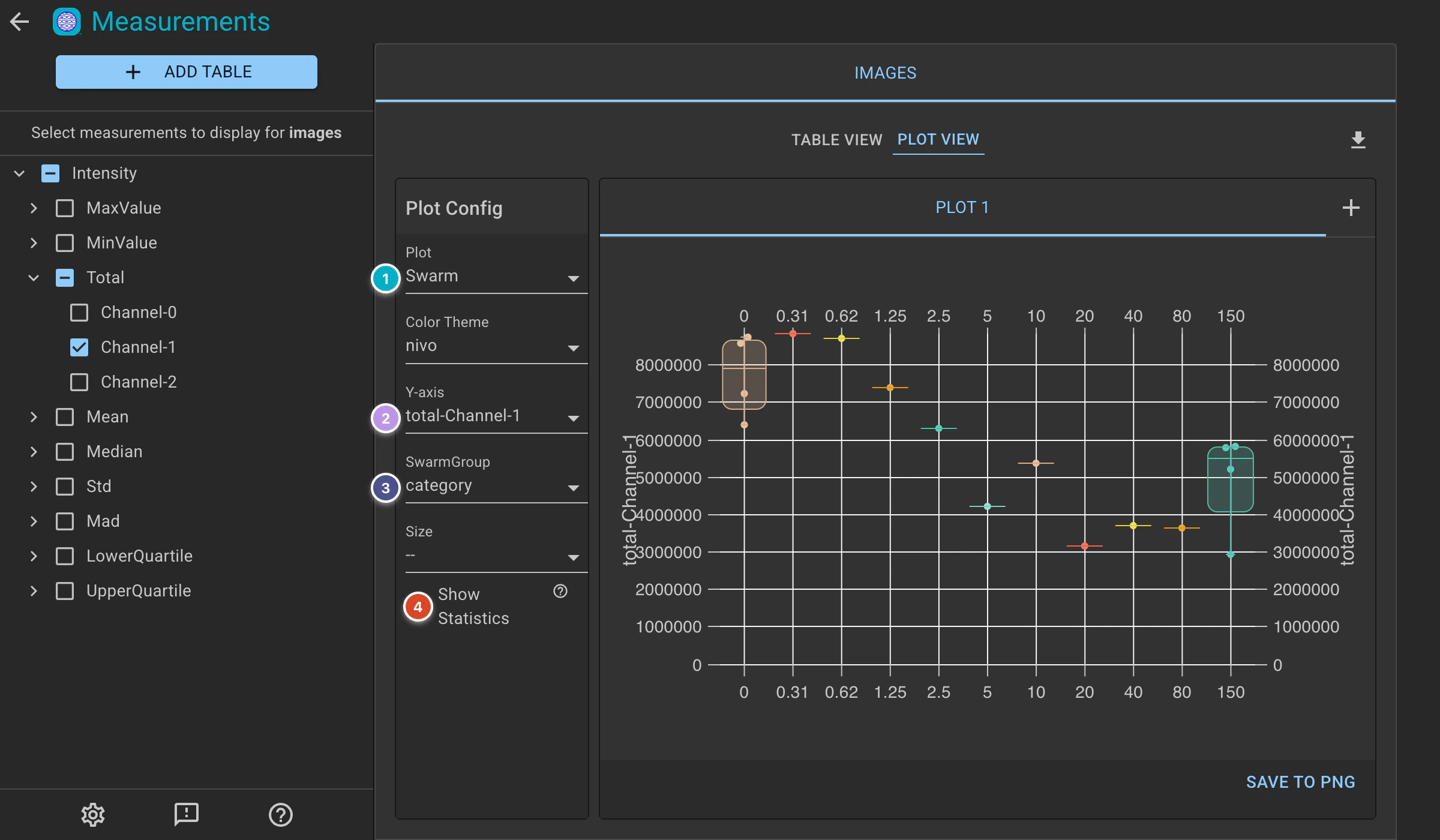
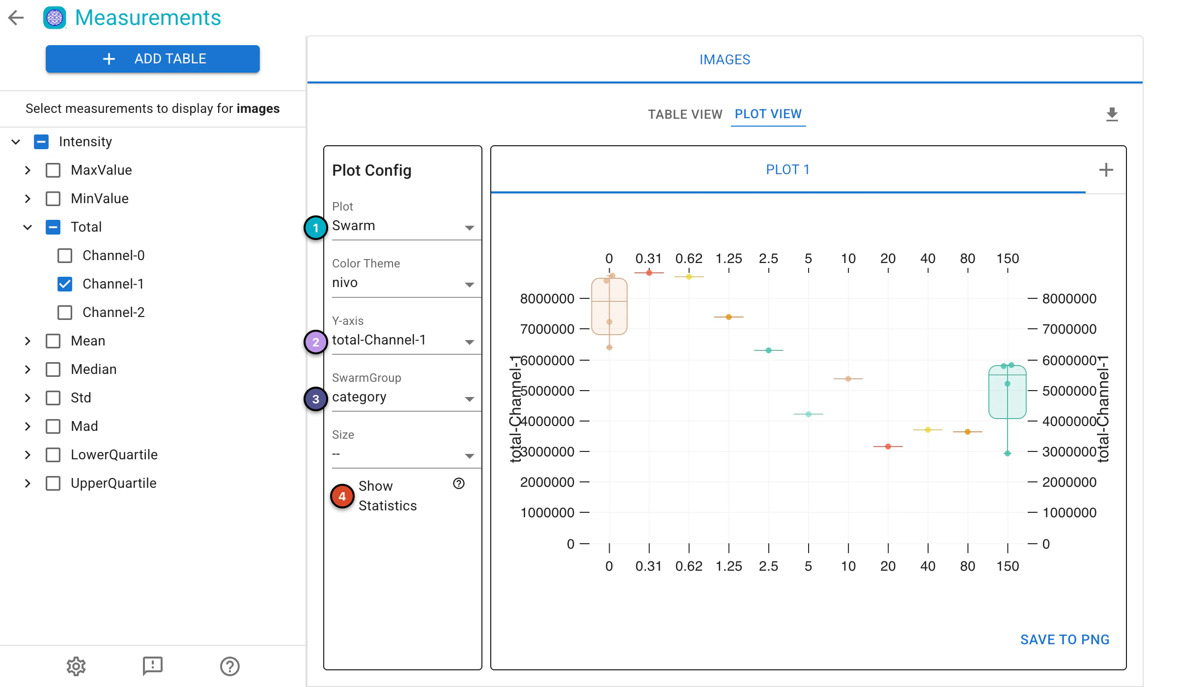
Swarm plot of the total GFP intensity per category.
10. Export results and save the project#
🔴 TO DO
Click
Savein the top left corner to save the entire project. You’ll see the Piximi logo animation as the save progresses .
.
11. Supporting Information#
Check out the Piximi paper: https://www.biorxiv.org/content/10.1101/2024.06.03.597232v2
Check out the Piximi documentation:Piximi documentation:https://documentation.piximi.app/intro.html
Report bugs/errors or request features piximi/documentation#issues